tl;dr version: If data is to be useful, it needs to be organized, formatted, prioritized, and presented so as to be accessible for ordinary users.
Data visualizations are more than charts and graphs; they include all the surrounding text and legends (aka “scaffolding”) that help users intuitively grasp the meaning.
By Dave LaFontaine
We are living through a “Big Data Explosion” right now; the sheer amount of 1s and 0s being generated, transmitted, collected and stored is absolutely staggering.
There is so much promise in the potential applications for all this data – almost enough to live up to all the hype.
Fun Fact: according to MIT, only 0.5% of all the data being collected worldwide is even being analyzed.
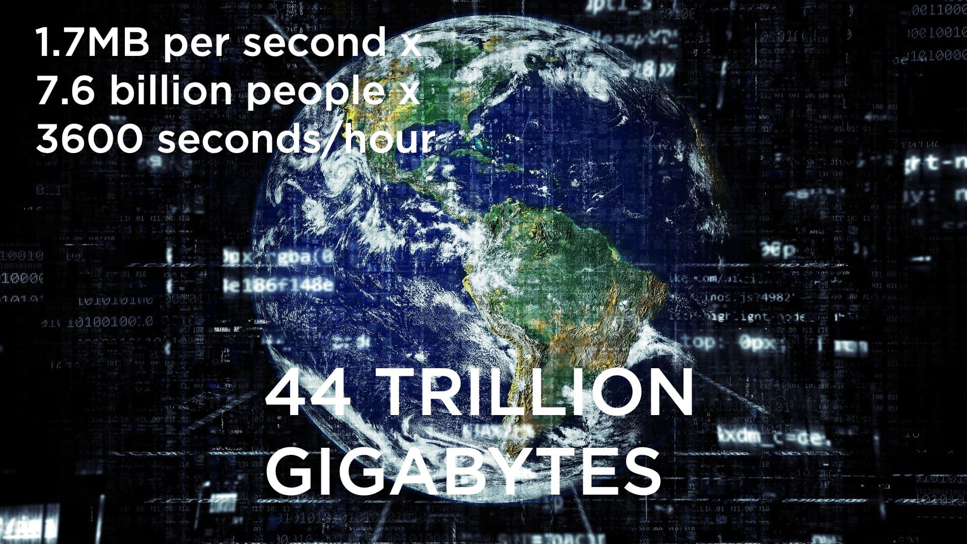
Unlike machines, human beings are not equipped to process & interpret massive amounts of information from random sets of numbers and messages. Well, some can do it – specially trained, elite soldiers, stock traders or NFL quarterbacks.
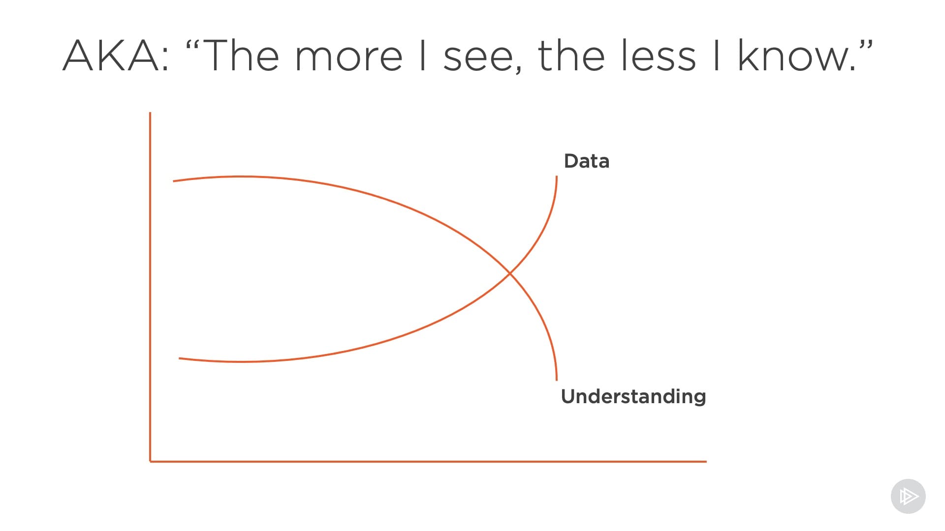
But for the rest of us, we need a bit of help with our logical capabilities, and presenting things visually helps us out. Otherwise, as this simple graph shows, quantity of data alone is not enough.
When we present data, we need to design things so that they can be ingested & understood by non-experts.
The problems arise because of an all-too-common human impulse: we’ve spent so much time, effort & resources to collect all this data, we better use every single scrap of it.
Result: organizations just shovel everything into the machine, slap on a few sorting algorithms, and see what happens. Google “spaghetti charts” for a sampling of where that approach leads.
This is where design needs to step in and save the data wizards from themselves – and, not coincidentally, also save the audiences in boardrooms around the world from mass confusion.


Design is about making choices.
What to leave in. What to leave out.
We call this “Storytelling.” If there’s one thing our over-saturated, always-on media environment has taught us, is that humans have an almost bottomless appetite for stories.
Don’t believe me? How many streaming subscriptions and/or TV channels are you currently paying for?
People love stories. They tell us things that elicit emotional reactions – love, hate, surprise, laughter, sadness, joy, wistfulness, excitement.
AI still sucks at telling stories
Smart as robots are at regurgitating learned patterns back at us, they lack the human factor that makes users pay attention, comprehend, and then internalize what they hear/see/feel.
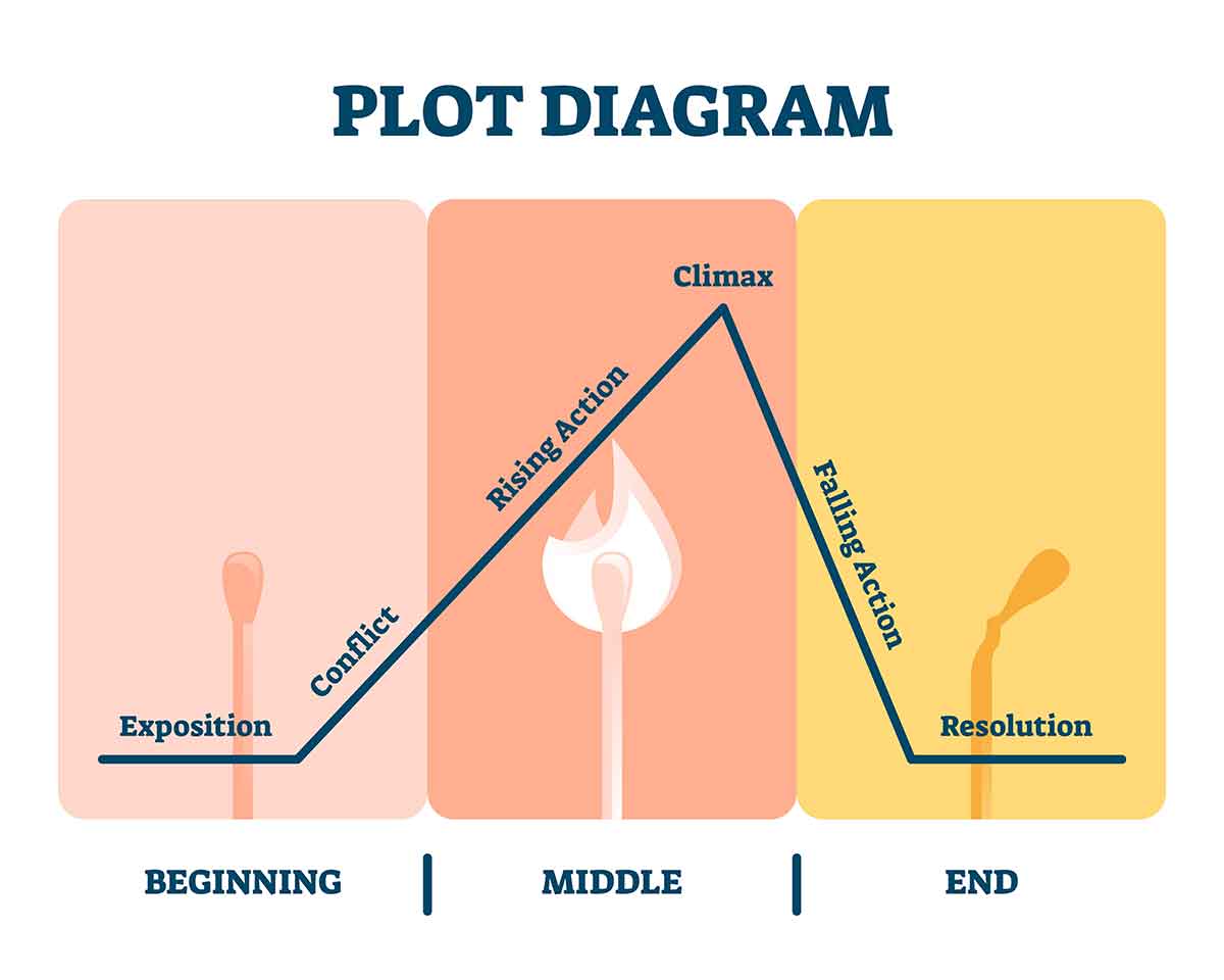
Designers bring context to facts, figures, analysis and insights; we intuitively know that people crave experiences with a defined beginning, middle and end.
And most importantly: A POINT.
All too many “data dumps” leave the users fumbling to try to grasp what their takeaway is supposed to be.
Which brings us to the most important addition designers can bring to data …

Relevance: a design force-multiplier.
A fundamental problem (at least for now) with machine-driven storytelling and design, is that computers are incapable to comprehending what is relevant to an actual living, breathing, human being.
A canteen of water is super-relevant to someone lost in the parched sand dunes of a desert. Somewhat less so if you are stuck on a leaky lifeboat.
Designers specialize in – overused buzzword alert – EMPATHY. Not in the sense that we’re all a bunch of squishy do-gooders; but that we have trained to develop the capacity for deconstructing user needs and intuiting what they want, need, and are interested in.
