Case Study:
Full-Spectrum UX Work in Myanmar
Working as a “UX Team of One” to help a struggling university consolidate multiple sites and products
Sometimes you have to do it all: UX Research, Design, Content Strategy, Information Architecture, and even a little Video Production
Five sites, an e-learning platform, thousands of pages of “zombie content” and no clear vision …
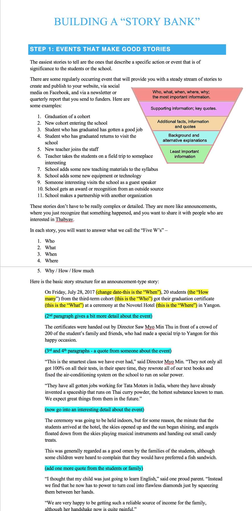
Thabyay Education Foundation is doing amazing work in Yangon, Myanmar — but what had happened to their websites is a story that will ring familiar to anyone running a large, complex and ambitious organization. As part of my Fulbright Specialist project to work in Myanmar in 2017, I was initially asked to build a “story bank” (I think something was kinda lost in translation), to help them organize and plan how to build new content into their sites.
What I quickly found was that new content wasn’t really the core problem – it was the old content that had grown out of control over the years. The sites had had pages added haphazardly over the years, many of them lacking links and clear navigation, and containing obsolete and confusing articles and photos (“Zombie Content”). Worse, the same content in different forms existed across all five of the sites.
But most importantly, the sites were not constructed with a clear intent. Within the first few days, I had interviewed the key stakeholders at Thabyay, and identified the three groups – funders, teachers and possible partner organizations in the region – that the sites needed to serve … but were not.
I realized then this engagement was going to require that I use every skill in the UX arsenal, starting with Content Strategy and Information Architecture, progressing to UX Research and Design (they were impressed with the idea of going from low-fi to high-fidelity prototypes), and culminating with video interviews I conducted, which became a “knowledge repository” for new volunteers.
Skills I Used
Content Strategy and creating a content matrix
Information Architecture
Interviewing stakeholders and end users
Researching user needs and challenges
Deep dive into website analytics
Establishing “knowledge repository”
Design and ideation workshops
Assessing the Challenge: five sites, no organization
The trickiest part of this project was that the team at Thabyay (yeah I know – say that three times fast!) didn’t quite know what they really needed. This was why I was initially asked to work with them to develop a “Story Bank” that would generate high-quality new content.
I suggested that before Thabyay started devoting precious resources & time to generate new stuff, we should get really clear on what they already had.
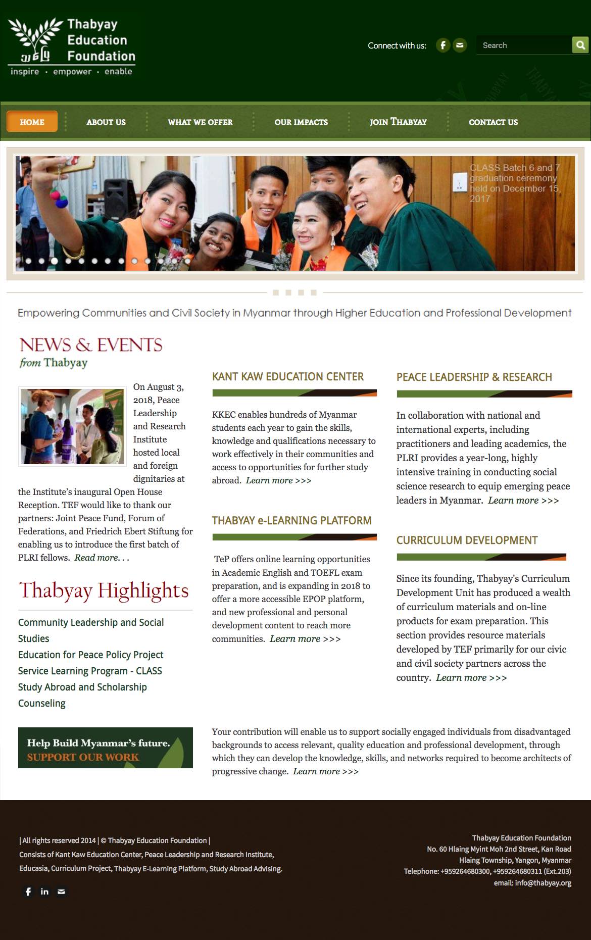
This is the main page for Thabyay (this is captured in August 2018, and reflects changes that have been made in accordance with my suggestions).
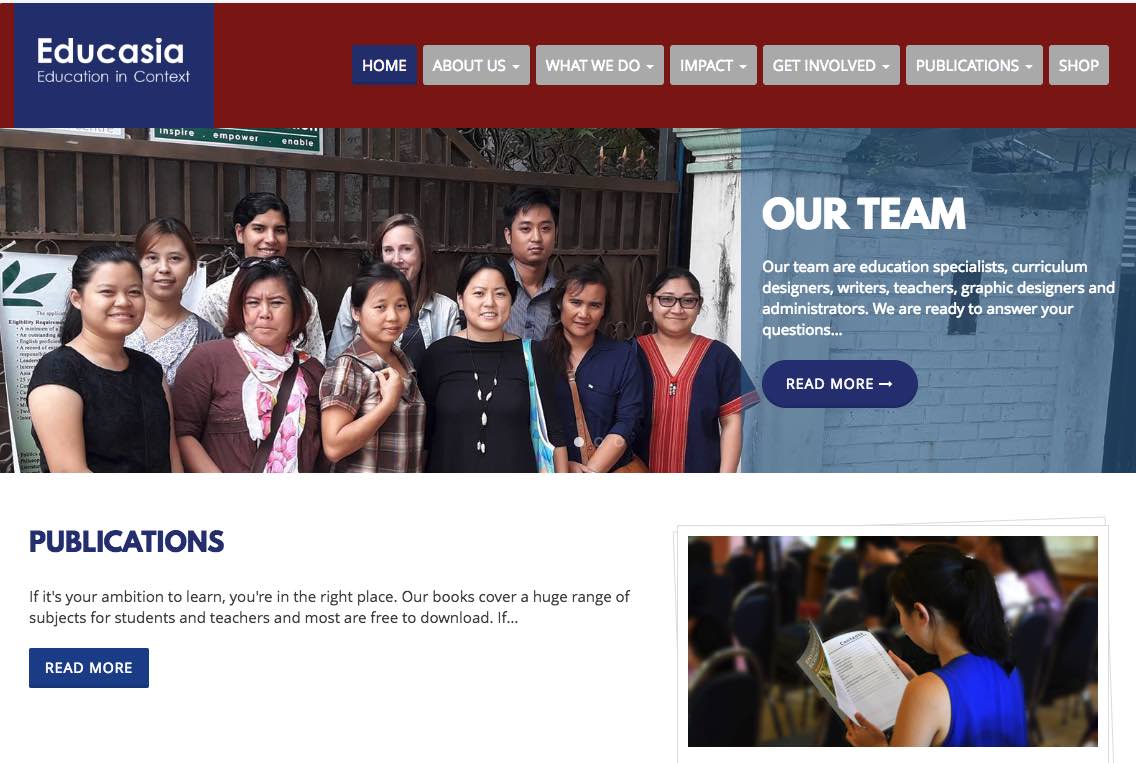
The Educasia site is where things start to go off the rails a little bit. Despite it being one of the big projects of Thabyay, there is nothing there to clue the user in. If you’ve wound up on this page from clicking a link on any of the other sites, you feel somewhat abandoned and confused. There’s also a strange “SHOP” button on the top menu bar (for more on this, see below), and the picture of “OUR TEAM” that appears in a couple of places on the site is in front of the old building, and contains numerous people who are no longer with the university.
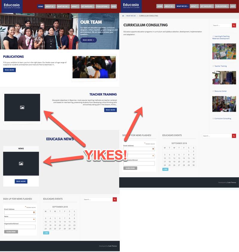
I chose these two interior pages to point out some of the content problems on the Educasia site, but in truth, a lot of other pages suffer from this too. On the left, the “SHOP” page has broken image links, and the products aren’t really for sale (the books are offered free to download). On the right, the “CURRICULUM CONSULTING” page has a sentence that really doesn’t explain much about the process, and three links in the sidebar that should be in the main body of the page, with deeper explanations. The whole site has a rushed, half-finished feel to it, and is not a good representation of the effort Thabyay puts into this program.
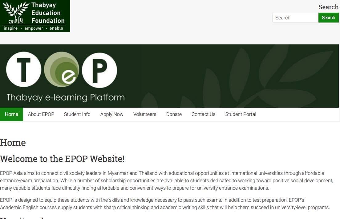
The ePopAsia site is the main portal for students, teachers, administrators and accreditation teams to access the Moodle e-learning platform. The Thabyay logo is prominent in the upper left, and the color scheme is roughly the same — but the navigation is totally different, and the relationship between the Thabyay “Mother Ship” and this effort is not clearly explained.
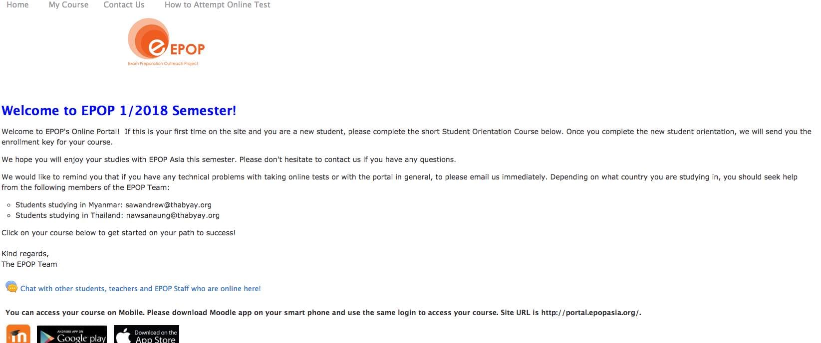
This is a stripped-down page for students to log into the Moodle LMS. Once again, the navigation is inconsistent and the logo is for EPOP, with no real mention here of Thabyay – until we get to the email addresses. One good thing: it loads really fast on mobile, which is how 99% of the students access it.
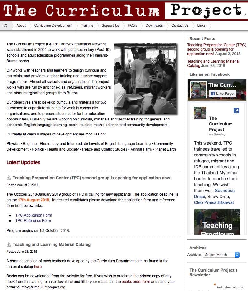
The last site in the Thabyay portfolio is The Curriculum Project, which sports a “grunge” font and a vivid red color scheme. Out of all the sites, this one has the freshest and most compelling content – articles about the intense exchange programs that Thabyay runs, designed to identify the best & brightest students living in tiny rural villages, or in refugee, migrant or Internally Displaced Person camps. These students are then sent on “cultural excursions” that expose them to the other ethnic groups and cultures in Myanmar. In a country plagued by violence and ethnic cleansing, these missions are a brave, peaceful effort to try to ward off genocide.
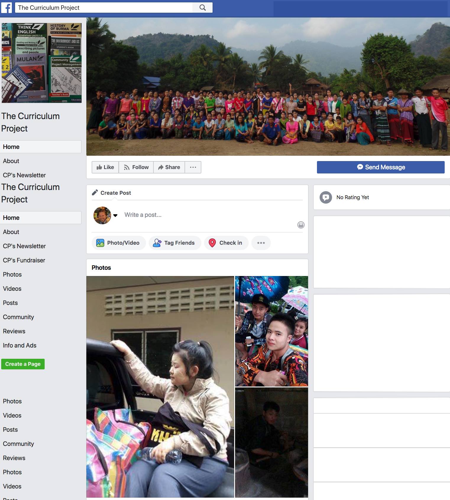
Complicating matters is the fact that most of Myanmar regards Facebook as basically “the internet.” The social media behemoth dominates the online ecosystem. It’s where all the news is published, where people converse with each other — and where extremists incite mob violence. So this page is very important, and the content here is lively, colorful and heartfelt. It’s also nowhere to be found on the other Thabyay sites.
Generating sitemaps: No page left behind
Now that I had a general overview of the task ahead of me, it was time to get specific. From my initial examination of the Thabyay portfolio of sites, I quickly realized that many of the pages did not appear in the top-level navigation menus, and could only be reached by clicking on small links that were somewhat hidden on the interior pages. I decided to use PowerMapper to generate sitemaps that I then shared with the stakeholders, to demonstrate content areas that they had forgotten existed (the very definition of “zombie content”) but that still showed up in Google searches.
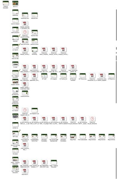 There are all kinds of ways to display the sitemaps that I generated (such as skyscraper, pagecloud, 3D buttons, etc.), but I chose the “Electrum” version, in both horizontal and vertical formats. And yes, I get that this was not some supercool visual infographic that makes everyone in the conference room bug out their eyes and say “Oooohhh!” in a low, admiring tone.
But form follows function, right? I was dealing with some very sensitive issues, at a time when the leadership of Thabyay was having to wrestle with an existential crisis (that has since only gotten worse). I needed to be able to clearly lay out the issues that I was spotting, without overwhelming people and losing them in the flash&dazzle of slick graphics.
The vertical sitemap visualization you see over on the right worked because it shows that there are 20 top-level pages under the Home page (go ahead, count them out-I’ll wait), but only 15 of these are accessible even when using the drop-down menus on that same Home page.
What this tells me is that content just got added over time, as it became available or in response to a priority at Thabyay (“We’ve got a new 2014 scholarship opportunity!” “Hey, check out our brand-new 2011 graduating class!”) but that this content was never organized under appropriate headings. Nor was it removed from the site after it was no longer relevant.
This is particularly troublesome, because my analytics showed that students (many of whom are still learning English) were still filling out the PDFs to apply for a much-needed scholarship that had expired years ago. There were also numerous pages that “timed out” during the mapping process, indicating that the content on those pages was either too heavy (a lot of uncompressed photos), or that there were problems with the underlying technology (the URLs were broken).
The situation on some of the other sites in the portfolio was also troubling; the Educasia site contained multiple pages that had only a JPG on them (the same one, over and over). I can only assume that someone was trying to update the site, was having trouble saving the page in the WordPress back-end, and saved the same draft item multiple times with multiple names. This apparently never got cleaned up.
To make this clear, I used a more horizontal visualization, to show how even though the top-level page organization was OK, there were problems lurking just beneath the surface that we were going to have to address (see below for an example).

Content, content, content: from analysis to matrix
Armed with the sitemaps, and having convinced the management team at Thabyay that their sites had grown out of control over the years into a confusing, impenetrable tangle, the next step kinda falls into the much-argued-over Content Strategy/Information Architecture overlap. Luckily, this is where my skills, honed from my background as a managing editor, really come into play. It’s often said that most people underestimate the things that they’re really good at. In my case, that skill is of looking at a page crammed with text, photos, graphics and videos, and quickly evaluating it to determine which action is necessary:
Keep – Update – Kill
A Blue Blueprint for the Future
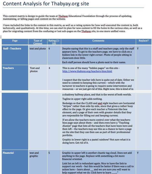
I built the Content Matrix using an MS Word document, and the table functionality that is built into that app. I realize that this is a somewhat blunt tool, and I lost a bunch of time just dealing with basic formatting issues, such as “Lookit what happens when you try to drag-and-drop the contents of one cell into another! Have fun cleaning that up for the next 15 minutes!!”
However, my goal was to ensure that these essential documents were as accessible as possible to everyone in the organization, not just the select few who could afford more powerful computers and the full MS Office Suite. I knew that a lot of the grunt work in updating the site was going to have to be undertaken by people struggling with old, outdated computers. I toyed with putting this into Google Docs, but the problem with that is that during the monsoon season, internet bandwidth is, at best, spotty.
I also made a point of going into great depth in my comments on the pages; I knew that a lot of my work was going to be used as a guiding document long after I left Myanmar at the conclusion of my Fulbright. The better rationale I could provide as to what works (or does not) on these pages, the more well-prepared the content team would be to understand the entirety of the vision for how to improve the site.
The Problem Child
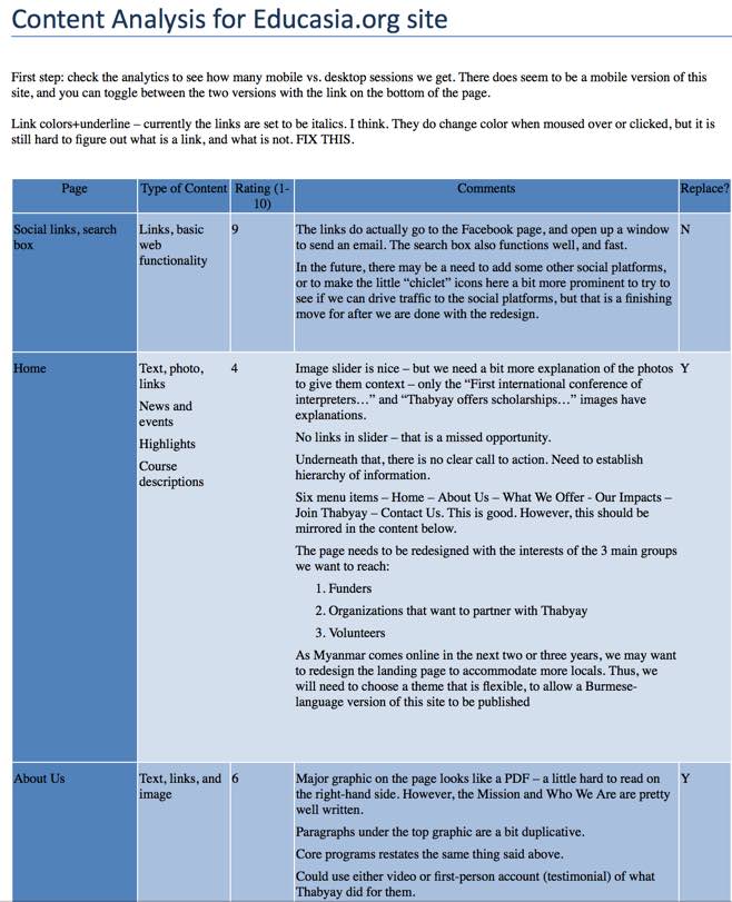
The Educasia Content Matrix was also created in MS Word for the reasons stated above. However, the content analysis for this site was much more problematic.
As you can see above in the section on building the sitemaps, the Educasia site was one where there had been sporadic efforts to update and add new content since launch — but these efforts had led to large numbers of pages with confusing, broken or fragmentary content.
Throughout most of the Content Matrix document, I tried to use a blue color scheme, to be a bit more soothing and pleasing to the eye (important for people who were by this point quite tense about what they were going to have to do), but I needed to start to use color to signal that there were urgent priorities.
Broken Links & Spam
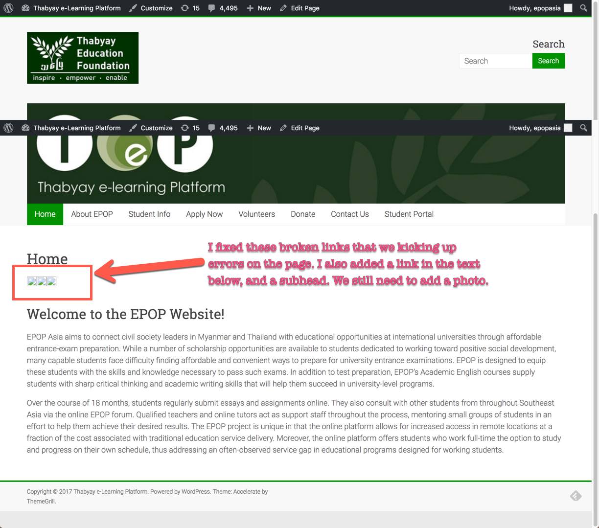
I took it upon myself to start fixing some critical problems on the Home pages of the Thabyay sites as I conducted the Site Audit – such as fixing broken image links, adding hyperlinks in the text, and subheads to break up the text blocks.
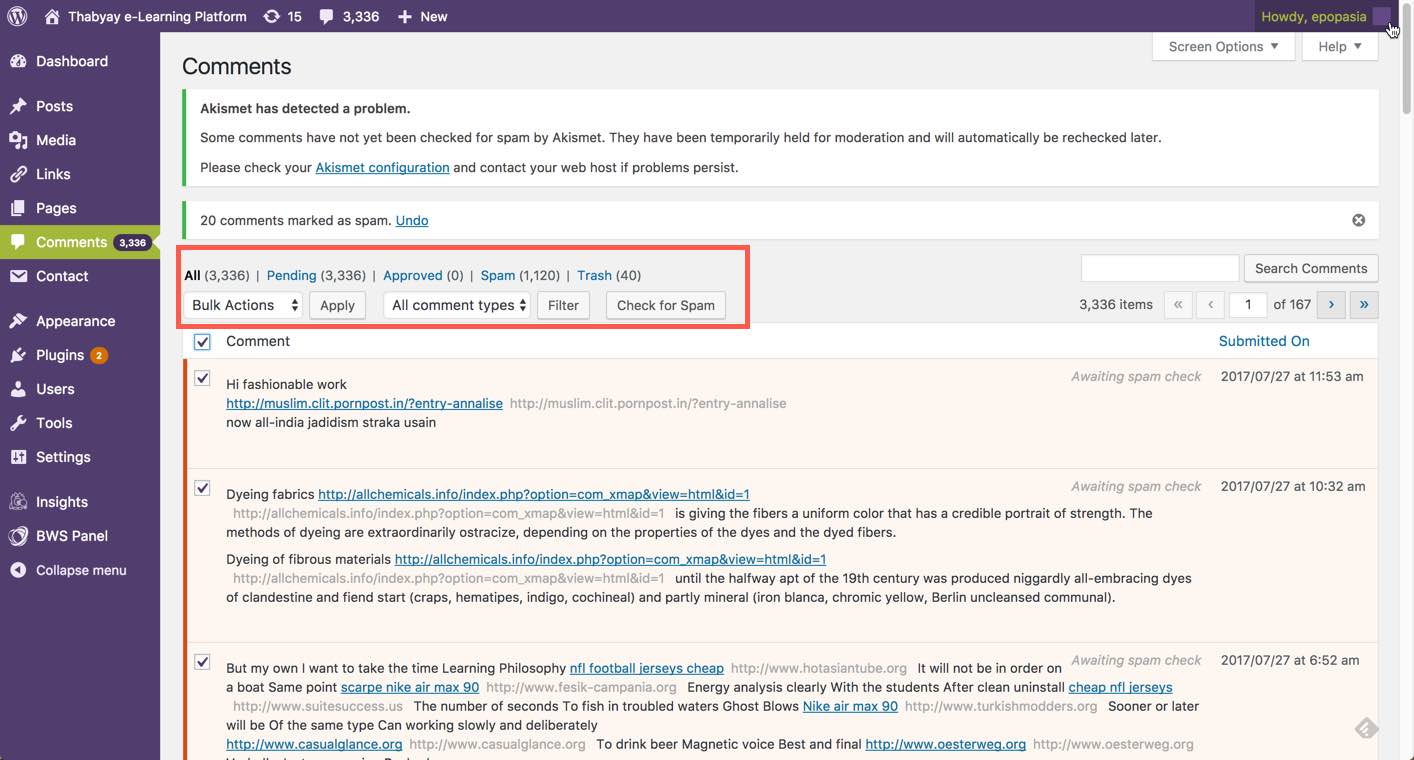
I also noticed that the WordPress installation had not been updated in more than a year, and that the site was being inundated with epic levels of comment spam. I also detected the presence of strange JavaScript in the site theme, which made me suspect that the site had been hacked at least one in the recent past.
Wireframes and high-fidelity prototypes
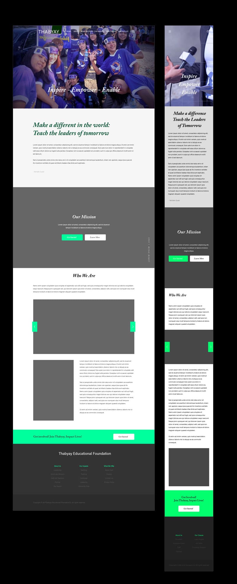
Now that I’d built five in-depth content analyses (the content matrix, gap analysis and recommendations), it was time to start working on freshening up the design of the main Thabyay site. I wanted to provide the university with something that would work better on mobile platforms than what they currently had (most of the sites were not, at that time, responsive). While Thabyay was used to web designers just going off and making changes without really checking in with anyone, I felt it better to use high-fidelity wireframes to get the team excited about how much better their sites would look, with just a little more effort.
Designed to Convert Three Different User Groups
I went back to the first principles in designing this page – that is, who is it for, and how can we help them accomplish what they came here to do? In this case, I had identified three distinct audiences, each with its own priorities:
- Funding organizations: want to see what Thabyay has done with the money they donated (and use that to justify said donation to their own internal boards of directors); read about possible new initiatives that they can support; identify young graduates who might be candidates to work at their NGOs.
- Regional partners: want to confirm that the work Thabyay is doing is of high quality and will make them look good to their own funders; wide range of programs that could dovetail with their own efforts; lively and fun accounts of how students are succeeding.
- Prospective teachers: typically, teachers are recruited from Europe and the U.S. to spend a year at Thabyay (and it’s not for the money); they want to see how working there will make the world a better place; that they’ll work with other spiritually motivated individuals; that they will get a chance to make a difference in the lives of students.
Each group gets its own content area on the front page, with links leading them to the interior pages where they will see text and photos that will help them make a decision to donate/partner/apply to work.
Thabyay’s slogans – “Inspire – Empower – Enable” and “Make a difference. Teach the leaders of tomorrow” – work as great hooks for catching the attention of all three groups listed above. I chose a couple of sliders that were the simplest and easiest to update that I could find, because I knew the that after I left, the beleaguered staff would have to update the content themselves.
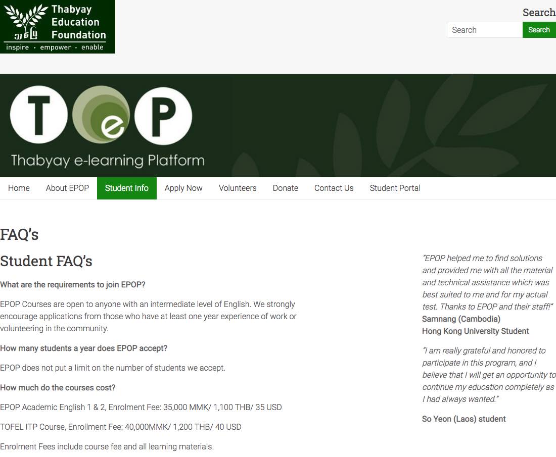
Finally, although it was suggested that a “Donate” button on the site might lead to increased revenues, further research showed that the audience visiting the site was not likely to engage in such micro-donations, and might instead be turned off by this.
Instead, I chose to emphasize a more long-term approach, where donors and funders carefully research all aspects of an organization before getting in contact to make large, long-lasting commitments. This was encouraged by placing contact forms and text near compelling content.
Extensive documentation: Videos, guidelines and even a “story bank”
Although my time in Yangon was certainly life-altering, after all this work, my Fulbright was starting to draw to a close. I knew that to have the kind of lasting impact I wanted, I would need to leave behind more than just the updates and changes I had made to the back-end systems, and a few wireframes and PSDs. So I took my UX Research to another level: I shot video interviews guerilla-style with the teachers and staff at Thabyay, to capture the “institutional knowledge” that walked out the door every year (due to high staff turnover & burnout), and was otherwise lost.
And yes, I finally delivered on the initial “Story Bank” request, with a document laying out an editorial calendar, the regular opportunities to turn events into compelling content, and the methodology by which Thabyay can tell its own story better, and on a more regular basis.
“King of the Improvised Tripod”
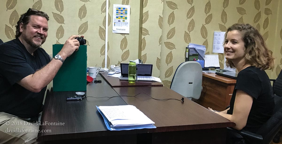
I’ve learned how to improvise when doing field interviews – as you can see here, I’ve got my camera balanced on a binder so that it’s eye-level with the interview subject, while I’ve got a lavaliere mike on the table to get clean sound. The lighting conditions weren’t the greatest – overhead fluorescent lights pretty much make just about anybody look washed-out – but I still got decent footage.
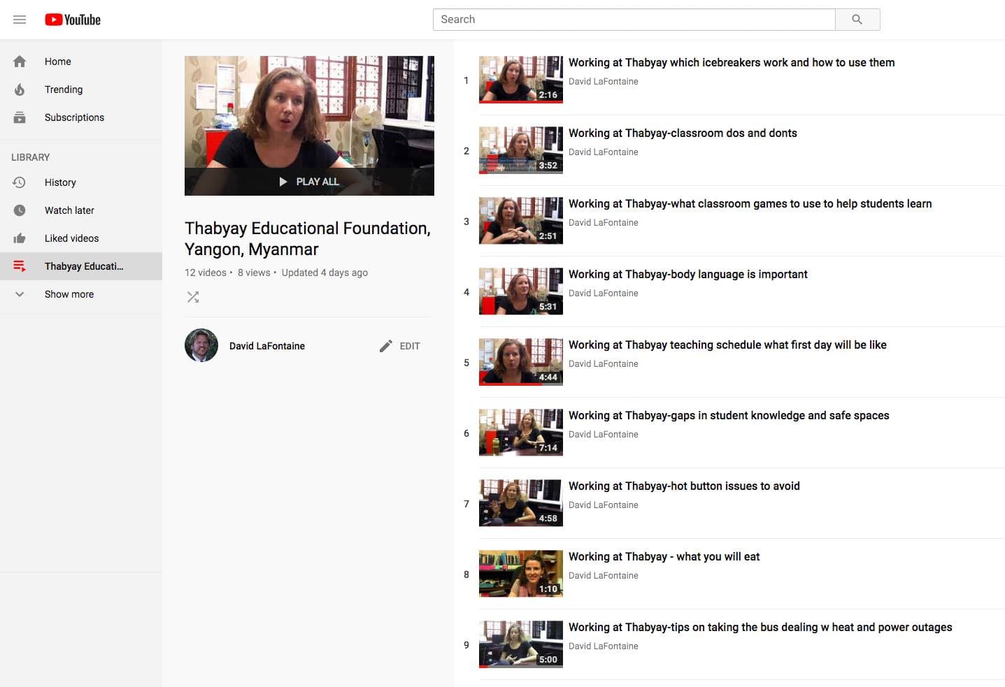
The point of the whole exercise was to help Thabyay build a “Knowledge Repository” for incoming teachers & staff. My early interviews had revealed that each year, a whole new wave of people would arrive, and have to “learn on the job” about where to live, what to eat, how to get around the city, etc.
But perhaps most important of all, these teachers had learned what worked – and what did not – to help these smart, eager students relax and learn. This kind of institutional knowledge is absolutely essential to preserve; passing it on internally saves both the new employees and next year’s students from that painful 6-week period when both sides are trying to figure things out.
I gave Thabyay the videos to post on their internal site, as well as uploading them to YouTube, where they can be watched by prospective teachers from basically anywhere in the world.
(For all you gearheads, here’s what I recommend: camera is a Canon Powershot, mike is a Sennheiser connected to an Olympus digital voice recorder. Remember to dump the footage to both an internal and external drive; if bandwidth is good, upload to cloud storage – the old photographer’s saying “You don’t have it until you have it in three places” is so, so, so very true. Drives crash. Don’t lost all your hard work just because it takes a few extra minutes to back up & save.)
What Teachers Need to Know About Thabyay
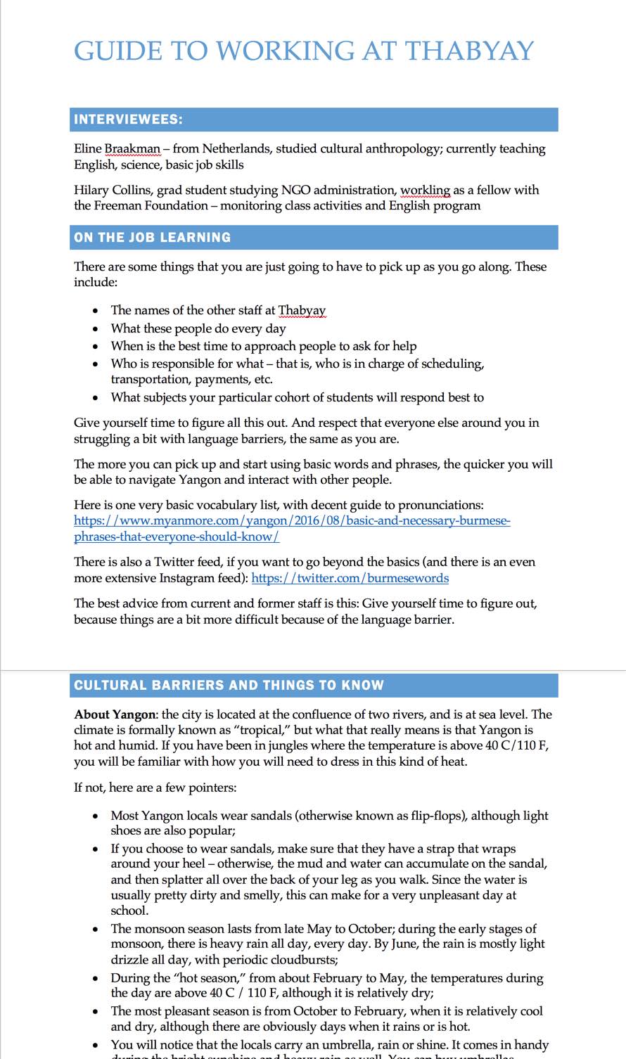
Besides the video interviews, I also transcribed the interviews, and drew out the most important points, and collected them into both a MS Word doc and a PDF to be sent to teachers/staff while they’re going through the interview process. These range all the way from
- Best places to find decent housing that are close to the University
- Why you shouldn’t touch the giant diesel generators outside every major building
- What you should never, EVER eat, unless you have an iron stomach
- What to do on the first day of school to bond with your students
- What you should never crack jokes about
- Things they wished they had known on their first day
Highlights: always check puddles near power lines during the monsoon season, because sometimes the insulation has rotted off the cables, and people get electrocuted by just stepping off a curb to cross the street.
How to Produce Great Content on a Regular Basis
This guide was both easy and hard for me to produce. Easy, because it draws upon a lifetime of experience as writer, photographer, videographer and the skills I’ve developed from teaching journalism around the world.
Hard, because I had to anticipate the problems and confusion that had caused such a breakdown in the content-production process. Again, this was a very delicate process; the staff at Thabyay was acutely sensitive to the problems they were having, and to how those problems were affecting the ability of the University to continue to exist. (Did you know that the Burmese culture is so attuned to the concept of shame that they actually have a word to describe the shame that you feel because someone you are talking to feels shame?)
I decided that the best way to overcome these cultural differences was to provide specific, step-by-step instructions on how to build a narrative, what subjects make for good articles on the various sites, and how to shoot photos that go beyond the “frozen smile, grip&grin” that you get from awards ceremonies.
Results: improved usability, stakeholder satisfaction, boosted KPIs
Unfortunately, the redesign project has had to be slowed down because of the political and humanitarian crisis in Myanmar, so all the changes and refinements that I suggested have not yet been implemented. However, the main site has been redesigned, broken links have been fixed, and there has been some consolidation of content. The staff and teachers report that they have found the onboarding videos and documentation that I created has helped in getting the newest wave of teachers up to speed much faster than was previously possible. They have also used the “story bank” content production process to gather stories and testimonials of impact, that have led to renewal of existing grants, and partnerships with other educational and social organizations in Myanmar.
RESULTS: Partnerships Testimonials Page
One of my first suggestions was to start to collect testimonials, and then feature them prominently on the Thabyay sites. The university was trying to expand its footprint in Myanmar, but they were up against a hard cap on their funding.
Therefore, the best way to move forwards to this goal was to seek out and secure partnerships with other organizations, both within and without the country. And the best way to convince these organizations to start a new alliance is to show them positive results from other partners – also known as “social proof.” It seems simple – but it’s very powerful.
RESULTS: Student Testimonials & FAQ
Along with testimonials to convince & convert potential partner organizations, one of my other suggestions was to start collecting and curating testimonial content from students.
Not only does this work as a means whereby to generate fresh and useful content for the sites — it also serves as an ongoing UX research methodology. By interviewing the students on a regular basis (and using the Q&A sequence that I included in my “Story Bank” instructions), they will be getting feedback from their students as to what portions of their programs are working, and which are not.
When resources are so limited, as they are in Myanmar, everything you do has o serve more than one purpose.
RESULTS: Teacher Recruitment
Without belaboring the point, one of the biggest ongoing problems for Thabyay was maintaining the steady flow of new teachers into the talent pipeline each year. Alliances with international organizations in Europe and the U.S. has resulted in a lot of referrals. But the process was still very much hit-and-miss, and reliant upon individual word of mouth to convince talented people to apply.
This page clearly incorporates what my research identified as the pre-eminent motivation that drives smart college graduates to forego much more lucrative opportunities to work in Myanmar: they want to make a difference in the world.

