THE CHALLENGE:
The Ostrow School of Dentistry at USC launched two new hybrid online-offline education programs, aimed at helping dentists learn crucial new skills without having to abandon their practices.
However, the sites for these programs had just evolved, and content had been added as it was created, without a clear plan or structure to lead users to the desired goals.
Thus, the site was disorganized, hard to navigate, slow, and a burden on staff, who found themselves on the phone, answering the same questions, over and over again.
Worst of all, the site was built using a clunky CMS, and the staff was unable to update it without significant time & effort.

INITIAL RESEARCH:
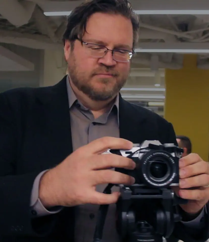
Stakeholder interviews: Before we started the redesign, we conducted in-depth interviews with potential students, as well as professors and administrators. A big part of the task was to organize and simplify a site that had grown out of control. To help bring my research to life, I videotaped a diverse cross-section of current and past students, candidly answering questions about their experience learning complex medical procedures online.
ACTIONS:
I performed a deep content analysis and produced a content matrix, evaluating which pieces of content were good “as is,” which needed some polishing, and which really needed to go.
I then produced wireframes, both on paper, and using Adobe XD (which also came in handy for this clickable prototype of the mobile version of the site).
These evolved into layered PSDs, which grew more and more high-fidelity as the clients produced updated content. I then migrated the entire site from the Joomla back-end to a more user-friendly (and extensible) WordPress install.
After the new content was added, and the old migrated over, we launched the new site.
RESULT:
The site was launched ahead of schedule, and was populated with a series of testimonial videos of both current students and graduates that I shot and edited.
The average number of sessions/month is up 95%, the number of returning users has more than doubled, average time on the site has increased more than 250%, and most importantly, the site visitors are clicking through to the “Apply Now” page, rather than pestering staff with redundant & annoying calls. So the site has decreased the time load on the staff, and given them something to show off at trade shows, where they recruit new students.
Oh yeah – and my designs were incorporated into the email newsletters, interactive ads, and other marketing materials.
