Online courses and training
Extreme Data Visualization Makeover
This training was designed to bring together the UX and Data teams, and set them a task that called upon them to work together to solve a series of increasingly difficult “Bad Data Viz.”
Each team was given a set of Power BI data visualizations with “broken stuff” that had to be fixed. The teams competed against each other both to finish first — and to finish best.
The broken data visualizations were built using PowerBI, a tool familiar to most of the Serious Data Nerds — and one that enabled me to quickly and easily distribute the pre-broken data viz to the blended teams.
It’s always amazing to me how much creativity can be unlocked when you just invoke the “sense of play” in otherwise-serious tech professionals. It’s always scary to stretch your boundaries and try to learn something new; making the learning process a silly game, with corny jokes and nerd humor helps defuse the anxiety & tension.
The winners got a subscription to Nightingale, the journal of the Data Visualization Society, as well as some free sammiches and the esteem of their peers.

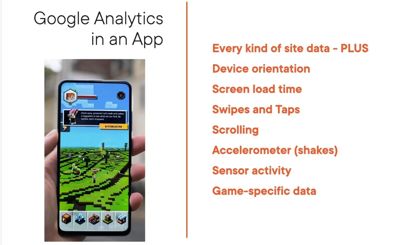

Google Analytics 4 Fundamentals
Google Analytics has changed! GA4 requires a clean break from the past, and you’ll need to know what’s new. In this course, Google Analytics 4 Fundamentals, you’ll learn to take advantage of the new, powerful AI-driven capabilities that Google has unlocked. First, you’ll explore how to obtain and deploy your new GA4 tracking code. Next, you’ll discover the all new user interface, including which data reports are still there and which are not. Finally, you’ll learn how to use the Analysis Hub and LifeCycle Reports.
Learn more and watch sample video at Pluralsight
Designing Data Visualizations
Course by David LaFontaine for Pluralsight
For this course, I’m taking a deep dive into my passion for combining data & analytics, with human factors & design.
Data visualization is one of the hottest topics in design right now, and I’m working hard to teach designers what they need to know about dealing with Big Data – such as how to avoid the Four Deadly Sins of Data Visualization.

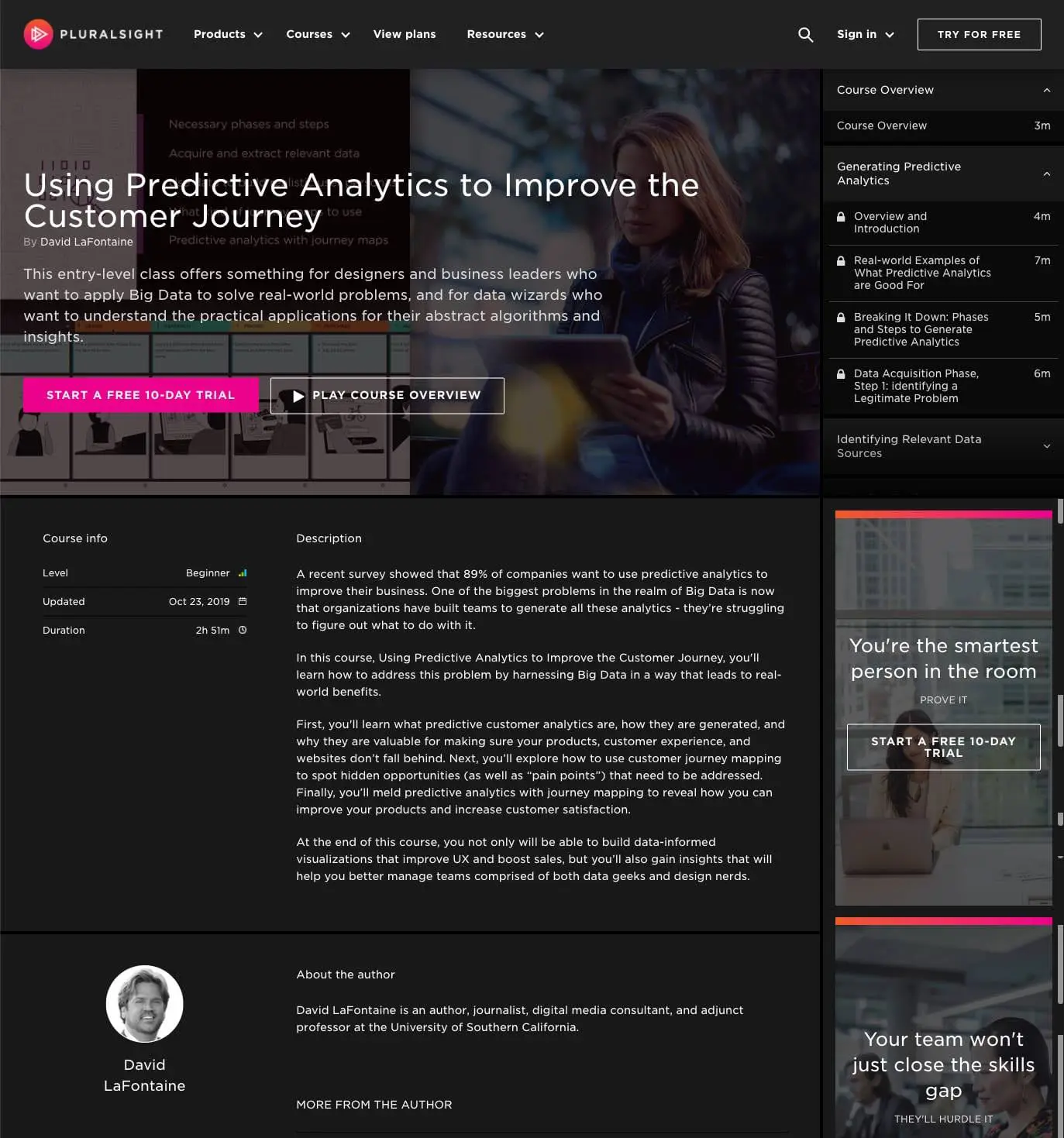
Using Predictive Analytics to Improve the Customer Journey
Training Video by David LaFontaine for Pluralsight
This course teaches designers and creative teams how to use predictive analytics to help map the customer journey. That sounds a little abstract – but the results are concrete: increased sales, better conversion rates, improved customer satisfaction.
Learn more and watch sample video
Google Analytics for Creative Professionals
Training Video by David LaFontaine for Pluralsight
One of my most popular courses for Pluralsight is called “Google Analytics for Creative Professionals.” Launched on July 8, 2016, this video teaches how to use the insights from Google Analytics to make web designs better.
Learn more and watch sample video

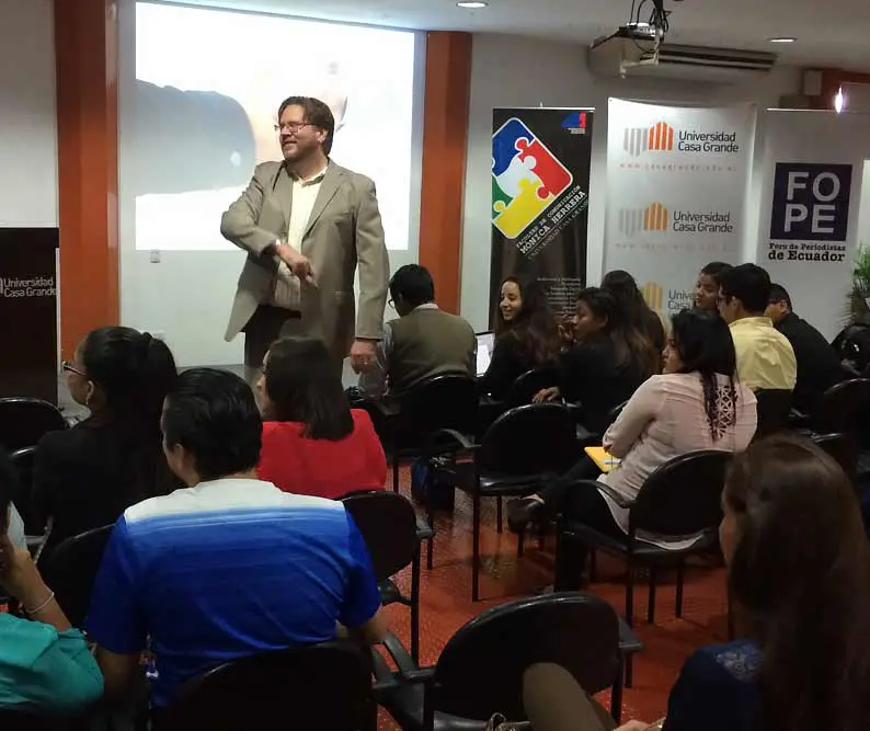
Speaker, trainer, professor
- I have spoken at conferences and events, including UXPALA’s World Usability Day, Digital Hollywood, Colombia 3.0, El Otro in Lima, Peru, and the International Symposium for Online Journalism (ISOJ).
- I offer private, custom training to clients.
- As an adjunct professor at the Annenberg School for Journalism at USC, I taught Digital Immersion and Online Multimedia.
- I have been a guest lecturer at more than a dozen universities in the U.S., Latin America, Asia and Europe.
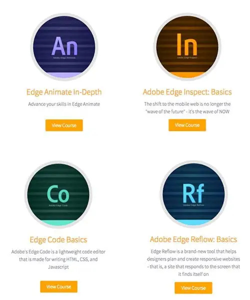
KelbyOne Training Videos
I created this series of training videos on the entire Adobe Edge Suite, including:
